

Foundations to Mastery: An Extensive Guide to UI/UX Principles
‘’Users form opinions about your website, but in reality it’s all about UI/UX design within seconds’’
On a cold winter day of 2026, we decided, as Intactdia team…No. It was just a lyrical pre-view to the most important part of your website. As you can see we started our article with a pretty canonical, but at the same time intriguing way of interacting with you. It was a written version of UI/UX design that you will learn foundationally about today. If you think that you already know the basics by reading cropped guidelines, well, you know the basics, but partially.
Today, we are sharing with you the groundbreaking guideline to UI/UX Principles that will turn your online presence into the perfect model of sucess. And enough of these too theoretical guides, we’re here to help with the most obvious practical examples. User Interface (UI) and User Experience (UX) design are at the heart of creating digital products that delight users and drive business success and you need to know everything about right here and right now.
Whether you’re the owner of a website, mobile app, or enterprise platform, mastering UI UX design principles is vital to stand out in the competitive landscape. Intactdia’s in-depth guide will equip you with an understanding of core concepts, actionable best practices, and the latest trends shaping the field. So, now the only thing that you need is to change your digital ‘Visitor’ badge of our blog into ‘Proud Explorer’ and here we go.
Intactdia’s Principle One:One Primary User Objective per Screen
‘’Your UI/UX design focus should be one user-if the user is glad, then the experience is success’’
If we go back to the early 2010s, we can see how simple the whole interface for any device is, closer to the middle of the 2010s, we see the number of interface functionality was increasing rapidly, but the decision-making process was prolonged on the contrary. The Intactdia team calls it Hick’s Law. Hick’s Law predicts that the time and the effort it takes to make a decision, increases with the number of options.
But when to use Hick’s law?
Intactdia suggests using Hick’s Law when response times are critical. It applies to any simple decision making with multiple options. For example, in your business website,Hick’s law can be used to narrow down big volumes of information without overloading the user. Use the following direction whenever you’re adding new functionalities to your UI/UX design:“When you need to simplify a complex process, use Hick’s law.
Practical example:
An example can be a payment process.Instead of showing everything at once, you can break it down. Show the screen with shopping cart details then another with delivery information, then optional account creation and so on. By reducing the number of perceived options on screen makes the interface more user friendly. It is also more likely that the user will accomplish the goal and not give up or get confused.
But, it is important to point out not to oversimplify! Breaking down choices to a series of too many small chunks can also cause the user to drop off before reaching the goal.
Remember Hick’s Law only works with simplified businesses,if your customer needs to make a profound research before the actual purchase, do not simplify the research! For example, choosing a dinner at a fancy restaurant or picking an AirBnB place to stay for your vacation next week.
These are complex decisions. Hick’s Law doesn’t work here and can scare away the potential clients. If you still doubt our suggestion, you can try it with the landing page, place a few important options to stand out among cluttered user interfaces and see how it will speed up the response times.
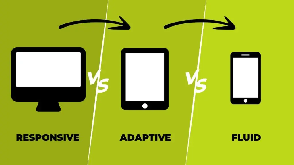
Intactdia’s Principle Two:It’s Important To Design User Flow Before Designing Screens
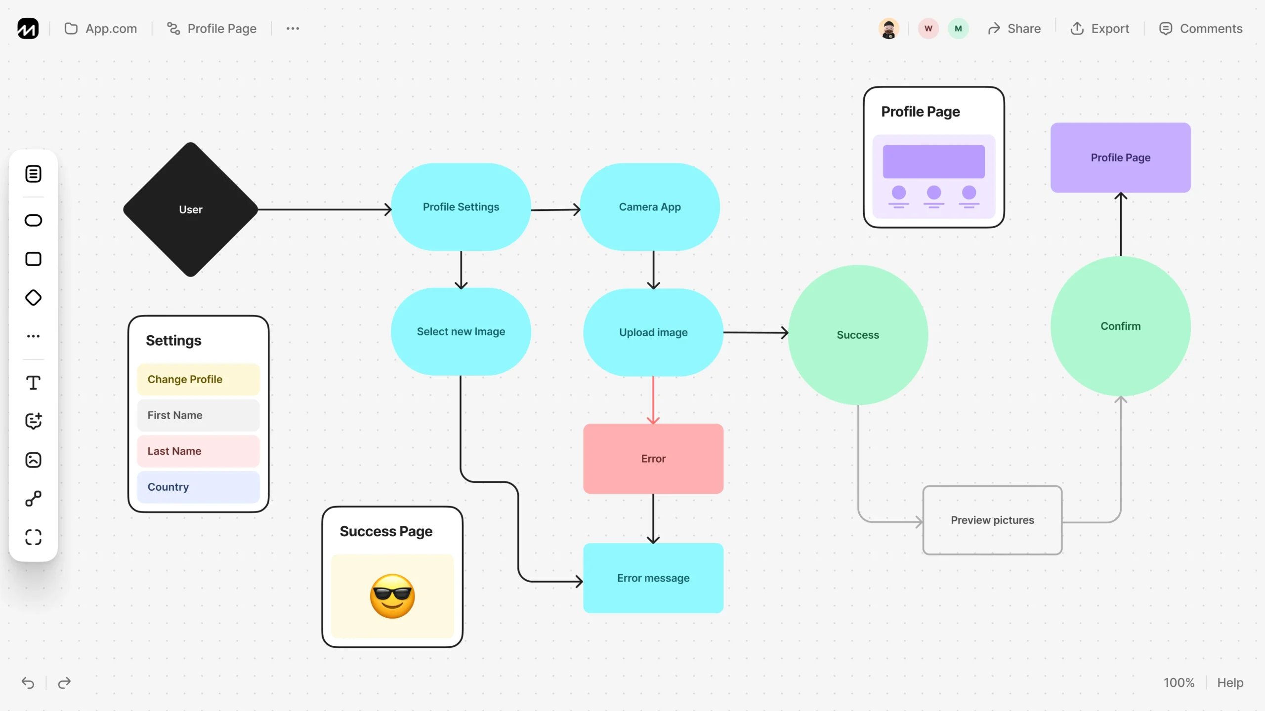
‘’Intactdia team highly recommends mapping the user journey before creating any UI elements.Users experience products as flows, not static screens.’’
If you ever, in the development process of UX/UI design, notice that the design team does not ask about the user flow structure, look for the other team. As designers, we have all heard about what User Flows are, and how essential they are. User Research and Information Architecture are important, but User Flows should be as well and often it is neglected or forgotten about in lieu of tight timelines. But you should Never neglect User Flow, cause that will basically mean that your business doesn’t know how to operate with the client’s purchases.
Intactdia specialists work with 3 types of User Flows:
-
- The initial flow-charts- Before we even think about the word wireframe, flow charts are what should have your focus. During the initial stages of design, it is essential to map out the flow of what we believe would be the journey of the user. It doesn’t need to be perfect.It can be scrappy, but they need to depict the journey well. At this stage, designers mostly create basic login/signup flowchart. It brings perspective for the long haul, but also allows us to map out the several different scenarios that usually go unnoticed since we are usually busy charting out the happy flow. We highly recommend that you step up your user flows and make them extremely informative for future use to include details like what the intent of the screen is, or the kind of content/fields it could have in the future.
- The component flows– After simple structure, UI/UX design specialists start to get started on the flows in parallel. At this stage, the crude boxes that we created at the beginning can be replaced by the screens, or at least a vague idea of a screen and the components that would comprise it. In this phase, we start chalking out the high-level components that will come into use and define their usage patterns. Exactly, at this phase, we get a bird’s eye view of what a final draft of the finished product would look, and function like (.e.g. On this stage,the components that can be identified are Page screen, Overlays, Success screens, Tab components, Stepper are added) .
- The final flows– Here, you need to confirm the created design as a business owner. Click-through prototypes are usually the equivalent of these flows, since they allow us to understand the end-to-end journey. But in the case of large-scale applications, it sometimes becomes imperative to document the flow of the entire application using real screens.
As a business owner, you should know that User Flow is an artefact that not just needs to be created at the beginning of the design process, but also something that needs to be meticulously maintained throughout the lifecycle of the project. This structure will not only help you understand how all journeys tie to each other, it will also help you estimate high-level component usage and come very handy while maintaining large-scale applications over a long period of time.
Intactdia’s Principle Three:Don’t Hesitate To Use Familiar User Patterns From Well-Known Businesses
’’UX/UI Design should be the blended version of the successful business websites in your niche and your unique features.’’
The design should always keep users informed about what is going on, through appropriate feedback within a reasonable amount of time.
‘’UX/UI Design should be the blended version of the successful business websites in your niche and your unique features.’’
The Intactdia team, in this section, provides the best practices of patterns that every business owner should take into consideration:
- Match Between the System and the Real World-Use words, phrases, and concepts familiar to the user, rather than internal jargon.Terms, concepts, icons, and images that seem perfectly clear to you and your colleagues, but can be professionally confusing to your users.
- Add’Emergency Exit’on the interface-Users often perform actions by mistake, that’s why potential clients need clearly marked “emergency exit” to leave the unwanted action without having to go through an extended process. Exit buttons will allow users to remain in control of the system and avoid getting stuck and feeling frustrated.
- Recognition Rather than Recall- Ideally the user should not have to remember information from one part of the interface to another. So, Do Not put Information required for the other pages as a repetition in every section, the information design (e.g. field labels or menu items) should be visible or easily retrievable only when it’s needed.
- Add shortcuts to the website navigation-Make the page transfer process smooth by providing keyboard shortcuts and touch gestures.
- Help users that are struggling to navigate pages-Use traditional error-message visuals, like bold, red text, do not use technical jargon during the explanation process. Try to offer users a solution, like a shortcut that can solve the error immediately.
- Use documented information, if there’s no other way for a solution– But make sure that the help documentation is easy to search and whenever possible, present the documentation in context right at the moment that the user requires it.
Remember, users came to your website, and they already had the experience of using similar websites, so your top goal is to stay as simple as your previous competitors, without any additional complicated interface actions, but with some unique features that will make people stay and buy your service. Intactdia specialists advise respecting established interface patterns to reduce learning effort and increase confidence of the potential customers.
Intactdia’s Principle Four: Daily writing is not equal to UX Writing
‘’ UX Writing is a mix of words to use or avoid, appropriate presentation formats, and how to structure information so people can quickly purchase your product.’’
Now we reach the part of information, to be exact, the UX Writing. Forget everything about normal writing principles, in UX Writing, it’s all about selling products in the shortest period of time. Business owners should know that from this time forward, everything that you write on your website is no more for you as a specialist, but for your clients, who don’t understand your services, but are willing to do so.
Intactdia’s specialists in UX Writing present top focuses that will completely change and boost your website content here and now, so get ready to dive deeper:
- Be concise-But not limited; it means something closer to efficient.Use as few words as possible without losing the meaning. When writing concisely, we, as a team, make sure every word on the screen has a job. For example, in a text with 4 sentences, at least 3,5 sentences should be about the actual job you are doing. And as Mark Twain said:“Writing is easy. All you have to do is cross out the wrong words.”
- Avoid long blocks of text-When using a product, users aren’t immersed in the user interface itself but in their work. So basically, users don’t read UI text-they scan it. Help them scan the text by writing it in short, scannable blocks. Add text into shorter sentences and paragraphs. You can keep the most important text up front and then ruthlessly edit what comes after it.
- Avoid double negatives-Sometimes, you can close your eyes on some grammar principles, and double negatives is when you actually need to.They increase cognitive load -they make users spend extra time decoding the message.
- Begin with the objective-If you are writing a text where a sentence describes an objective and the action needed to achieve it, start the sentence with the objective. For example, ‘’Tap on an item to see its properties’’.
- Make the copy consistent-If you decide to call the process of arranging something “Scheduling” in one part of the UI do not call it a “Booking” in other parts of your UI.Plus, you should avoid using synonyms.A common mistake can also happen in combining forms of address. Don’t refer to the user in both the second person and the first person within the same phrase.
- Write in present tense-Strongly avoid using future tense in the UX Writing. Write either in present or past tenses,for example, ‘Video downloaded’.
- Write in the active voice- Even in the website blog posts avoid using passive voice at all. By increasing the number of sentences in passive voice, your SEO rankings are getting lower and lower.
- Try to use numerals-Use numerals in place of words for numbers, e.g. instead of ‘You have two missed calls’, you can write ’You have 2 missed calls’.
- Use ‘today,’ ‘yesterday’ or ‘tomorrow’ instead of a date-This writing tip prevents users from using a calendar each time they want to know when the event happened. But, be careful, you shouldn’t be using it when indicating the deadline of the sales campaign or any other applicable events,it can be confusing or inaccurate.
After implementing all Intactdia’s UX Writing tips, potential customers will be able to comprehend information easily and speed up the process of purchasing.
These 4 principles indicated in our guideline will make your potential, current and long term customers to feel confident while using a product. And remember when interfaces are clear, predictable, and supportive, users focus on their goal-purchase.