
How Mobile-First Design Affects Conversion Rates
Since 2020, there’s a wide discussion is going about the mobile-first designs.Some business owners stick to desktop first model, while the others try to find out more about this phenomenon of 21st century.And if you need any other proof what how impactful is mobile first design, we can provide with only one statement-over 63% of the web’s traffic comes from mobile devices. As you can see it is more important than ever for business owners to consider how their content is experienced on a smaller screen.
The mobile first design is completely different to the desktop version, because most users do not browse on mobile, they enter it for purchasing the product. If the interface is poor, then in 90% they just leave and it’s highly unlikely that they switch to the desktop version.As mobile devices come in various sizes, so it’s important to consider how consumers will be viewing your content. The main difference from the desktop version and at the same critical moments to focus on is how your services are displayed on a small-screen.
Today, we shall provide business owners with the information about top practical mobile-first design tips that have a direct, measurable impact on conversions.

One Action Per Screen
If on the desktop version, brands can somehow add a little more information on services, when it comes to the mobile version, it strictly should be one page with only targeted actions. People use their thumbs and fingers on mobile devices, not a pixel-perfect mouse cursor. And exactly this fundamental difference demands a complete shift in how we design interactive elements. You are building your online presence for touch right from the beginning.
You need to focus on these core ‘One Action Per Screen’ moments while designing the mobile version with developers:
- Generous Target Sizes: Many businesses either make the button too big, or even worse too small for users to tap it.It is critically important when it comes to the document reading process, potential customers are struggling to find key CTAs to navigate the page. It is recommended to have a target size of at least 44×44 pixels as a great rule of thumb.
- Ample Spacing: Don’t gather tapable elements together.Your page should have only one button,in rare cases two. Leave enough space between them to prevent users from accidentally hitting the wrong one, which can lead to further frustration and leaving your app permanently.
- Make interaction gullible: Feel free to use common mobile gestures like swiping and pinching, but it should never be the only way to access crucial information or features.
Ideally your mobile page should have:
- One main CTA (for example Get a Quote, Book a Call)
- Supporting text should be added only if it helps that action
- Remove secondary links that distract
No matter if you’re executing market research via your mobile app, selling products or writing blog posts, you should know mobile users scroll fast. When there’s one clear action(even if it’s long), they are more likely to complete it instead of hesitating or leaving.

As Always Optimize Speed First
You can create the most authentic mobile version of your website, but if it has speed problems, then everything goes to waste.Nothing kills user engagement faster than a slow or unresponsive app. Let’s imagine ourselves in the shoes of potential clients, they finally found your mobile app, clicked on it with the excitement that in 5 minutes purchasing process, but yet, they’re looking at the logo of your brand for 7 seconds.Would you wait another 7 seconds or leave this app? The answer is crystal clear.
The reason for the slow speed, in 90% of cases, is heavy images, animations, and scripts- that can cause users to abandon the page before they convert.Many business owners want to copy-paste the content from desktop version to mobile one, this decision is wrong from the core, as the mobile version should be as practical as possible and set for actions only.
First and foremost,in mobile first solutions, you need to prioritize performance,visuals second,because all these customers are on your mobile app, because of the one CTA, to buy your service.Intactdia team, with decade long experience working on building mobile apps to businesses and startups, and one of the initial steps that the team takes for its clients are:
- Compress images (into WebP format)
- Keep autoplay videos only on desktop version, not on mobile
- Using lazy loading more (the user will be seeing your mobile visuals only if they are interacting with them)
Keep in mind this golden rule: your mobile page loads in 3 seconds, as it builds trust and keeps users engaged long enough to act.
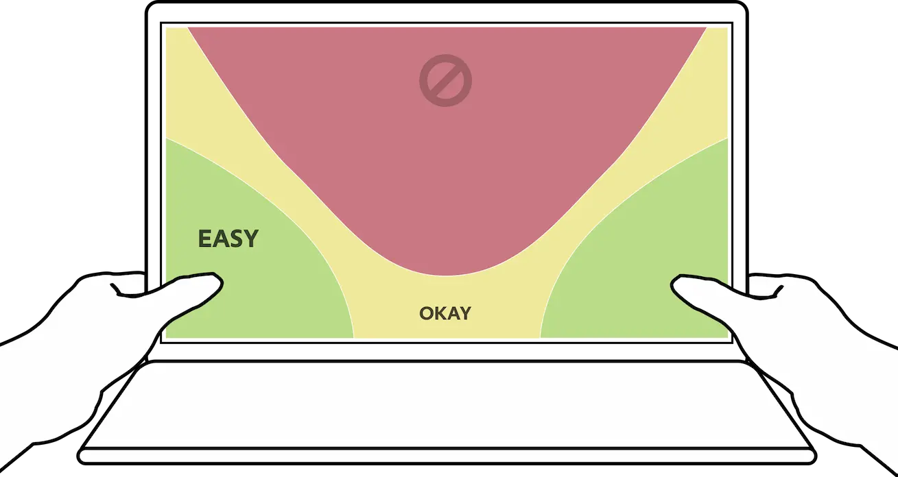
Keep The Mobile Interface Thumb-Friendly
As we are talking about the mobile first solution,the fact that most often users do not have both hands free to operate the smartphone, the designers should facilitate one-thumb interaction for your app. It can sound quite neutral, but according to the recent stats,thumbs-friendly design stresses on arranging features and controls that are close to the user’s thumb, thereby physically making the phone more comfortable and easy to operate.
As a business owner that also navigating mobile app, you should take the following tips into consideration:
- Use Fewer fields (ask only what’s essential)- do not put too much detailed information about each section (maximum one sentence with key words)
- Large input fields and buttons-all the input field and buttons should moderately big, but definitely not small, because these fields lead to conversation
- If it’s applicable try to use autofill and proper input types-Sometimes, user can prefer autofilling in many input fields, rather than filling them up manually, take this insight into consideration.
- Stack fields vertically-if we’re talking about ideal geometry position for the content right before the conversion-it is definitely vertical position.By putting the fields into vertical format, you can optimize the whole user experience with thumb-friendly design.
Use less fields to increase conversion rates. The perfect formula for user-friendly mobile design consists of easier forms, faster completion and higher submissions.
Business owners need to make the whole mobile design unique, but at the same very user friendly.Mobile-first solutions will skyrocket your conversations in no time only if you can build its design with clarity, speed, and ease of action.