
Landing Page Design Mistakes That Reduce Conversion Rates
Have you checked our website and built an impression about Intactdia? Whatever the answer (and hopefully it was yes), there’s a high probability that you made your mind up within the first twentieth of a second. As we know, first impressions count, but this study shows that the brain can make flash judgments almost as fast as the eye can take in the information. And what do you see when you enter the website? Correct, Landing Page. And instead of the first 20 seconds, your brain makes an impression about anything within the first 50 milliseconds of viewing.
And here’s the most important part, according to the practical experience made by Lindgaard and her team, volunteers participating there were able to judge the website after these super brief seconds, and they did not want to double-check the landing page, because they believed in their decision. And that means only one thing: In the crowded and competitive world of the web, companies hoping to make millions from e-commerce should take one notice, unless the first impression is favourable, visitors will be out of your site before they even know that you might be offering more than your competitors.
And today, we indicate top landing page mistakes that you need to know about immediately in order to solve them and get the best impressions for your online business presence.
Make Headline Talks About User, Not About You
Put yourself into the position of the potential customer, no one wants to see the generic headlines that don’t clearly communicate value or outcomes. On the landing page they do not want to see the company description (there’s a separate page for it: About Us), they want solutions to their problems. The following solutions will solve the headline issue on your landing page:
- Include numbers to your headline-Numbered-list headlines can have astronomical click-through rates. And one of the key tips is larger numbers are more comforting in future-oriented or abstract contexts. For example, such text as: A loan payment of $100/month for the next 180 months can be more attractive to users’ eyes rather than putting years instead of months. Another key point is when the larger benefit was presented first, it “anchored” the viewer’s perception of that benefit. In other words, 100 albums for $5 each is perceived as a better value than $5 each for 100 albums. It is purely the brain logic-it perceives the larger benefit first and assigns a larger value to the rest of the sequence.
- Write headlines between 5 and 9 (or 16 and 18) words-some studies show that titles with eight words had the highest click-through rates, with these headers performing 21% better than average-so consider the length of your title if you want to get clicks. And importantly, the first two words—specifically the first 11 characters-make the most difference in getting people into the content.
- Consider using negative headlines– by negative we mean these keywords: Never, worst. Recent studies show that negative superlatives in titles perform 30% better than the control-and more than 60% higher than positive ones! It van be due to the reason that positive headlines are overused right now, and many users look for the unexpected and intriguing interaction.
We think adding to its next component is also useful. And this is-two part headline, where the first part will be about grabbing user’s attention by using negative headlines and then switching to the explanation (service) that can help them with their problem.
Make Your CTA Psychologically Strong, Or It Will Ruin Your Service
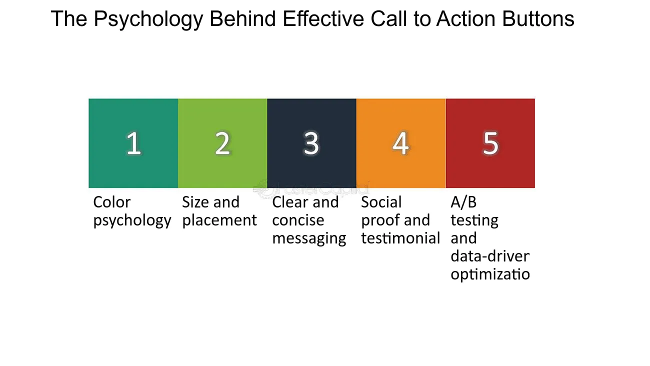
Business owners have to understand the importance of optimizing your CTA buttons, as they can significantly ramp up your conversion rates. But, what is CTA? A call to action, or CTA, is a prompt on your website that encourages visitors to take a specific action. Basically, it is a button that drives your visitor to that action. Here, you can analyze top directions of CTA that you need to change on your website:
- Usage, at least, of 1 CTA is a must–humans are naturally driven to complete tasks. When you see a CTA, it creates a sense of urgency or curiosity, making you to click and find out more. So having at least one CTA on your website is a must
- Colours matter-Choose a color that stands out from the rest of your site to grab attention. And it’s not only the colour pattern,the color should also align with your brand’s identity. For example, such educational platforms as Coursera have implemented this very well on the website, by combining different branding colours and differentiating between the two CTAs.
- CTA needs to be visible-Your CTA button should be big enough to be noticed, but not so large that it’s overwhelming. For example, on the landing page itself, potential customers should be able to spot it easily without having to search around your webpage.
- Positioning plays a huge role-Your CTA button should ideally be placed in a visible spot where users can easily see it. Usually, developers place it above the fold, but it’s not a hard-and-fast rule. We recommend you to do a couple of A/B testing to see which option is the best for your online business.
CTA can bring a huge problem without outcome clarity. It can create hesitation among users and misunderstanding of your services. While placing CTA, founders should only ask one question in their head ‘What will happen after users click the CTA button’.
You’re Not a Famous Brand Yet. Don’t Ask Too Much Information
We all want potential and existing customers to get addicted to our business website and engage with us. But, since you are at the very first stage of sales, and yet no one knows about your brand , you need to gather leads. And the most convenient way of doing it is design forms. You need to take into consideration these practical moments while compiling a webform:
- Simplify lead form-A lengthy form can cause unnecessary aggravation. Keep the form as simple as possible, but in the case of additional sections, progressive disclosure– only in the case if the user is on the brick of making purchase, for example: in the e-commerce website, if the shipping address is different to billing one, then additional box is provided to the user to fill up information, and it’s only the addresses are different.
- All the labels of the questions should be clear-Do not use professional jargons or slangs, you’re facing different generations and professionals here.Useful tip: Try to implement placeholder in the blank spaces, for example: a box labeled PASSWORD and inside the box it might say: 8 characters, 1 capital letter & 1 symbol, so the process is very easy for the users to meet the requirements.
- Use inline validation: In the case of any errors, inline validation eases the customer’s frustration. For example:As you type the password, there may be times when the box is shaded pale red and a message is displayed beside it indicating if what you’ve typed so far is a weak, medium, or strong password. With this navigation, potential customers will be in total online comfort.
- Autofill is your best online hack– If, at the end of the day you see that the form cannot be short, then the best solution to cover it up is using autofill. It features information such as name, address, and phone number that can offer convenience without endangering someone else’s sense of security.
With the Intactdia team, any business is fully ready to use the top-notch landing page at any phase of business development. By using our innovative catalog of tools, you and your team will be able to choose the most profitable web development tools for successful entrance into the online market.
In the 21st century, you and your brand have only one chance to make the perfect royal flush with your online presence, and exactly with this reason your highest-converting landing pages are set to be clearer, faster, and easier to trust.