The Role of Logo Design in Brand Recognition
There are a lot of things we can say about the logo, but one thing is clear: logo is that OG element which determines whether a consumer notices a brand, remembers it later, and distinguishes it from competitors. And if 10 years ago the logo was purely about the visual representation of the business, nowadays as the attention span of the audience is getting shorter-a logo often becomes the primary identifier of a brand. The effective logo helps business wonders with reducing marketing effort, increases recall, and strengthens brand positioning. It all can be achieved by using distinct shapes, colours, and typography, logos help ensure that a brand is easily recognisable and memorable.
The logo acts as a visual ambassador, communicating the brand’s promise and the quality it stands for. This makes the design of a logo a critical task that requires skill and intent, ensuring it effectively represents the brand across all platforms and touchpoints. And today, you will learn all the main principles of creating an iconic logo, small and yet the biggest mastermind component of the brand.
Principle 1: Simplicity is the key to the memorable logo for the decades ahead
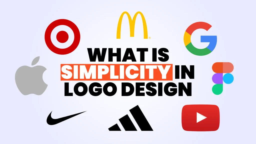
In an attempt to create something new and original, designers try to cram too many ideas or elements into one mark. This look in the logo can scare potential customers and the general audience, because they have only one attention span that most likely will remember one core element. Your logo carries the purpose of your brand and in the case of overly complexity, the purpose and with it, the selling detail is ignored.
From a practical standpoint, a simple logo performs better across multiple formats and environments. Brands today must use their logos on social media icons, mobile apps, websites, merchandise, and print materials. A complex logo with excessive details may lose clarity when resized or viewed quickly. These top tips can meanwhile guide on the way of building a simple, but yet marketing almighty logo:
-
Use fewer elements-Avoid unnecessary details helps in creating a clean and straightforward design.For example, use minimal lines and shapes, which can effectively convey the brand’s message without clutter.
-
Basic shapes are your go-to tactic-Geometric shapes like circles, squares (ideally 1–3), and triangles are highly effective in logo design due to their simplicity and versatility. Combining these shapes can result in unique and appealing logos. For instance, the Olympic rings utilize simple circles to create a powerful and recognizable symbol.
-
Limit Your Color Palette- Use a few well-chosen colors ensures that the logo is easily recognizable and adaptable to different backgrounds.
-
Select Clear, Legible Typography-Overly decorative fonts can detract from the logo’s simplicity and effectiveness. You can use the example Google and FedEx logos to build a clean, straightforward typography to enhance readability and recognition.
-
Scalability at all sizes-A scalable logo retains its clarity and impact whether it’s displayed on a small mobile screen or a large billboard. And this specific moment is very important to take into consideration sizes, test logos in black and white to ensure clarity without color and to avoid unnecessary gradients, shadows, or intricate illustrations.
Your logo’s simplicity means it will be recognizable not only online, but also remains effective whether it appears on a shoe, a billboard, or a smartphone screen.
Principle 2: Consistency can be repetitive process, but it builds recognition and trust
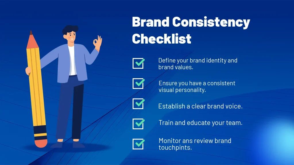
Consistency, overall, can sound like a boring process, but the uniformity of logo, colours, typography and tone of voice, builds trust and credibility with customers. By constantly presenting a professional and reliable image, companies reduce confusion and establish clear expectations. Among iconic consistency we can point to Coca-Cola and Nike, their visual and verbal consistency over years solidifies credibility and trust.
But, it’s not only pure repetition of the logo that can be considered as consistency, one of the top tactics with modifying it can be making collaborations with the well-known brands that will make your logo more memorable and recognisable. Logo can be escorted by a consistent voice and image, promoting customer loyalty. So, the logo itself with the core components cultivate a devoted fan base.
And even though as business owner, it’s not your top priority to know the exact details of the branding, we as Intactdia team, suggest you to know these technical guidelines for the further check-up of the visual side:
- Your brand guidelines should clearly define the following elements: RGB values for digital screens, CMYK values for printed materials,Pantone codes for specialty printing, Hex codes for web use
Here’s a simple example of how you can document your branding color values:
| Type | Primary Blue | Secondary Gray | Accent Red |
| RGB | 0, 84, 166 | 128, 128, 128 | 237, 28, 36 |
| CMYK | 100, 49, 0, 3 | 50, 0, 0, 50 | 0, 88, 85, 7 |
| Pantone | 301 C | Cool Gray 7 C | 185 C |
| Hex | #0054A6 | #808080 | #ED1C24 |
So, in other words, having these values in place ensures your brand’s colors look the same, no matter where they appear.
- Font guidelines- Create a Font Package with authorized fonts, weights, and sizes to all team members, so whenever they are putting a logo somewhere, or writing on behalf of the brand they know the branding standards.
- Scale and size guidelines– Always use vector formats (AI, EPS, SVG) to ensure the logo stays crisp at any size, from a business card to a billboard.
By creating your own branding book, you will practically increase trust, as consumers associate stable visual identity with reliability and professionalism, no matter if you’re B2C or B2B business.
Principle 3: Your customers need to emotionally connect to your logo
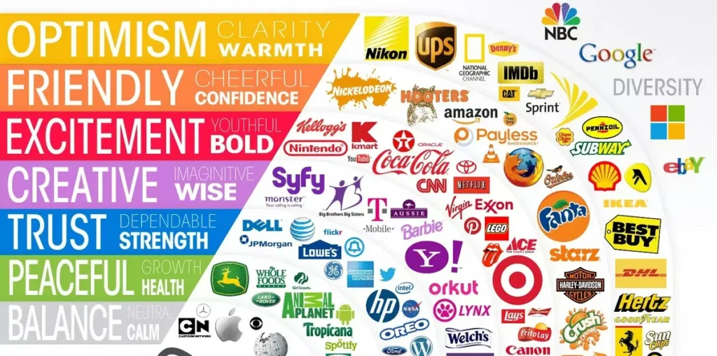
Your brand logo needs to emotionally appeal directly to the customers. It’s beyond simply selling a product, service, or experience, but purely focuses on creating an emotional connection that resonates with the audience. If traditional branding often emphasizes the features and benefits of your brand, emotional branding engages customers on a more personal level. This type of branding is all about what you bring to the table as an organization and highlighting why your customers need you. And now let’s look at the key points of creating emotional ties with the logo:
- Color preference: Take into consideration that specific colors evoke distinct emotions, e.g blue for trust, green for health/growth, red for excitement, and yellow for happiness.
- Shape preference: If circular, curved designs feel friendly and inclusive, sharp angles convey strength and innovation.
- Typography patterns: You can use Serif fonts that feel traditional and reliable, whereas sleek, bold fonts suggest modern confidence.
- Focus heavily on targeted audience: Logos should match the target audience’s values (e.g., luxury, eco-friendliness, fun) to build a lasting bond rather than just looking good.
By emotionally aligning these elements with a specific, intended feeling (such as comfort, safety, or joy), your business logo becomes a visual anchor, significantly increasing brand loyalty and reducing the need for, or reliance on, constant, high-stakes marketing.
In real-world applications, a logo functions as a strategic asset rather than a decorative element.With Intactdia ‘s more than 5 years of expertise in branding, your business logo will be built on a blended strategy of innovative and traditional elements for the long lasting legacy in the local and global markets.