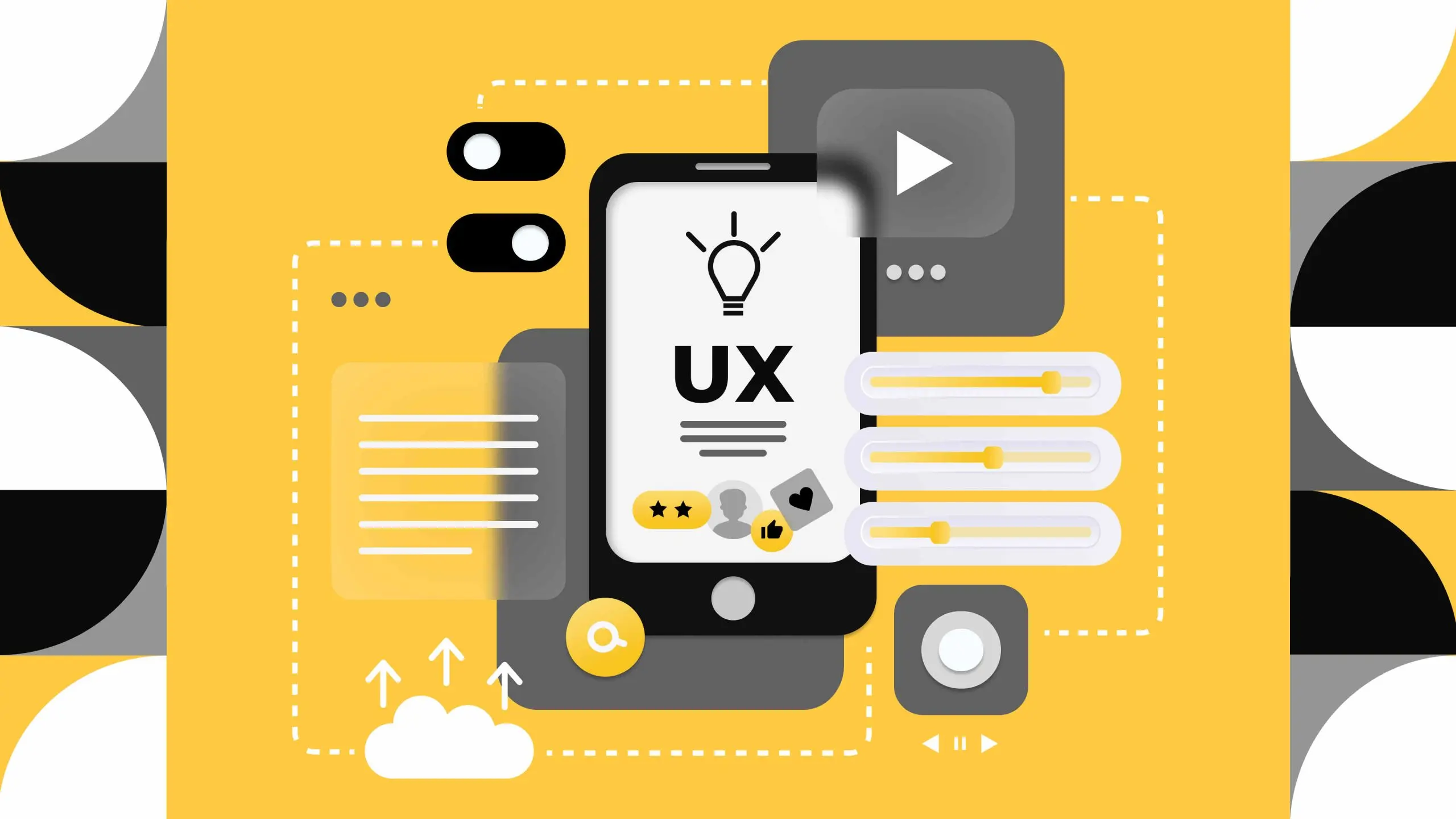
UX Design Principles That Turn Visitors Into Customers
If the business is failing, most of the time owners point out two reasons for that: a)Product/Service is bad or not needed by customers, b) Marketing efforts were not enough for the brand. But there is one, not that visible element, but one of the main direction that can swipe your digital presence from the core and it’s UX Design, or User Experience. User experience is important because it tries to fulfill the user’s needs. Your services can be unique for the customers and maybe they don’t know how useful it can be for them, exactly for that reason, your website’s UX Design should be able to provide positive experiences that keep a user loyal to the product or brand.
UX Design allows businesses to define a meaningful user experience on their product that is most conducive to business success. UX design directly influences how visitors think, feel, and decide. When UX Design is executed correctly, it removes hesitation and gently leads users toward conversion without pressure.
Originally, the process of implementing UX Design consists of these steps: User Personas, User interviews, Job Stories, Functionality map, Wireframes, Prototyping, and Usability testing. But today, we isolate ourselves from the canonical rules and guidelines, and switch to three UX principles that have the strongest and most proven impact on conversion.
Step By Step UX Design Is Good: But Users Must Understand Your Value Immediately
Here, we shall be geeks about theories and laws, and present you with a short but mind-changing example. Imagine It’s Friday night. You came home from a very long work shift and the only thing you’d like to do is to browse through a streaming site, scrolling through comedies, dramas, and thrillers. But as you switch from one streaming page to another, the list grows longer. The movie catalog and all the unnecessary information is following you with each click. And what do you do? Yes, you’re closing this streaming platform and turning on the one which can give you quick options.
And now we want to ask you this question: can you relate this annoying situation to your business? If yes, that basically means that the number one problem of your brand’s lack of
conversions is poor UX Design. When a potential customer lands on your website, she/he ask these questions:
● What is this?
● Is this for me?
● What should I do next?
If your UX does not answer at least one of these questions, then the client leaves it-even if your offer is strong. You need to remember that customers want to spend less effort on the daily buying process. Here are the top tips on Value Design that can change your whole digital presence:
➔ Do not use strong company language-you are not pitching to the specialists, you are pitching to real clients, who only want to use your service
➔ Rewrite your homepage headline to describe the result you provide- do not waste the headlines on purely technical terms
➔ Reduce CTAs to one main action per page- instead of 5 pages describing how to buy your product, create one with the main key steps
➔ Highlight client personas-Most of the time, business owners forget about clients themselves while they are describing the benefits of the services. Highlight who the service is for, for example ‘’perfect for the businesswomen after a long workday, or ‘’top choice for the teachers during workshifts’’
Remember that it’s all about the clarity; if the content is 50% technical, the other 50% should be definitely as common as possible, because your services target individuals who are using your service in their daily life.
No one Needs Friction (Or They Do?): Every Page Of Your UX Design Should Be Effortless To Use
For many users the friction part of UX design is still heavily discussed. Basically, friction is creating step by step user experience for your customers by adding to that additional steps. Though, traditionally, business owners do not like them, because it prolongs the product consuming time of the customer, it also has a positive effect on the UX process.
Ideally, frictionIt is required to disrupt the unconscious movement across the site or mobile app and to drive attention to the key call-to-action pages. And of course, we cannot forget about the most important step that it’s part of It-it builds a 2-step authentication or necessary security actions prior to confirmation or completing the desired action.Additionally,friction in UX is required if users need to confirm their orders, perform irreversible actions, or when users are entering personal data or sharing sensitive details with web platforms. Friction is here to identify
that users are not on autopilot mode when accessing your e-commerce store, landing page, marketing campaign site, or mobile application. One of the core benefits of friction in UX is eliminating accidental clicks that may take users outside the original platform or web experience. It is totally focusing on that target that users stay engaged with the current blog, news article, or store page, especially when using mobile devices or older generation laptops. Overall, we can say that the friction part of UX design is built for users to gain a feeling of complete control and security over their experience while engaging with a more interactive site or application.
But, we cannot deny the negative effects of it, such as unintentional lag, image-heavy experiences, or multiple pop-ups or confirmation blocks. This all can lead potential customers to greater attrition and cart abandonment. It’s heavily related to e-commerce platforms, where companies want users to perform too many actions in the beginning, especially when it comes to the payment process. Another breaking point of using friction in UX design is lengthy form-fields. This is a deal-breaker for many users who prefer logging off rather than providing extensive unnecessary information to websites, without a save or preview option. Friction can be deadly for your business if you’re in regions with unstable internet connections.
As a business owner, you need to make sure that you can control both versions of UX friction, and right now we recommend to take into consideration these crucial elements:
➔ Remove all non-essential form fields-if there are 50 steps until customers can get into the buying process, remove most of it immediately, leave only the crucial 3-4 steps
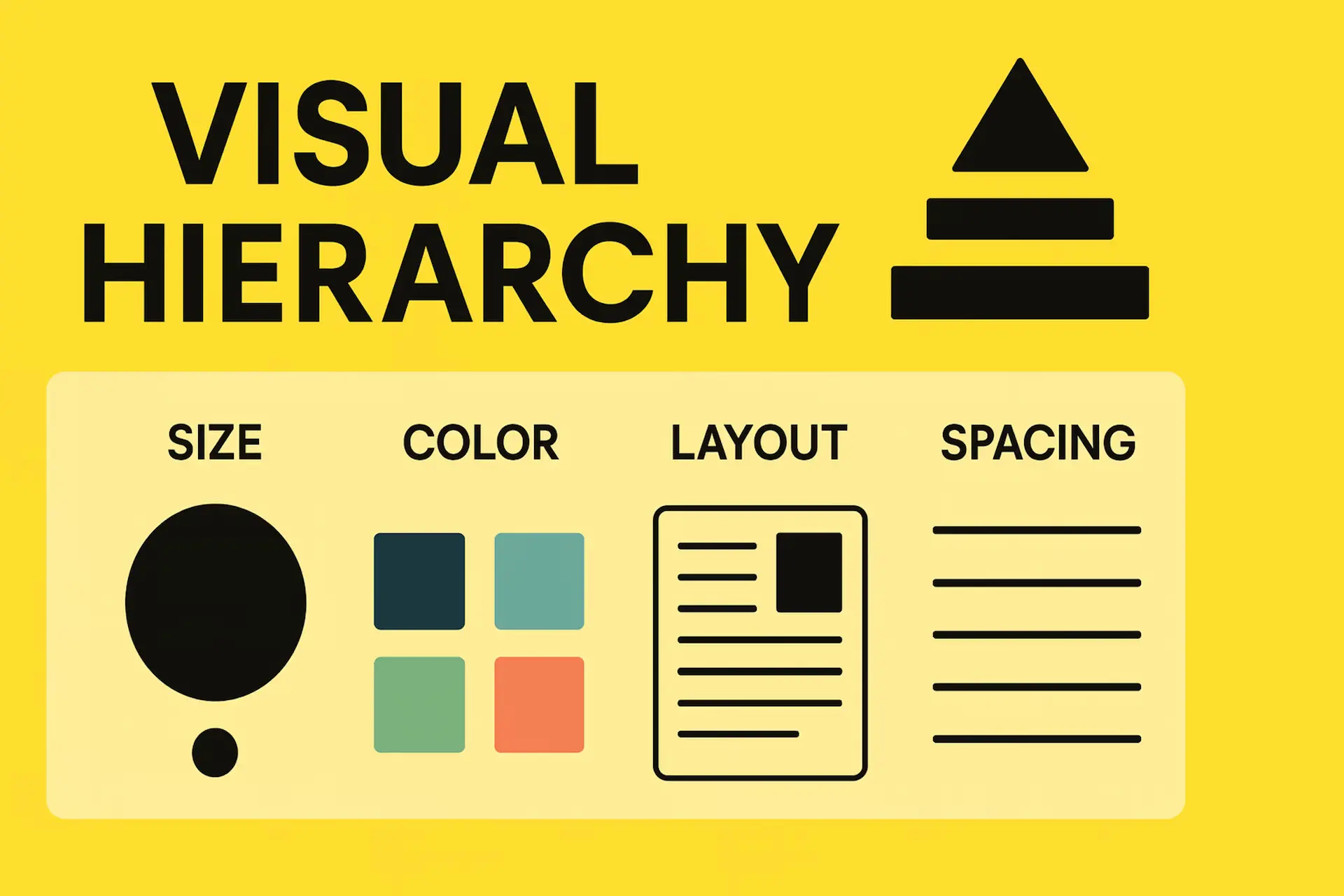
➔ Make buttons visually apppealing by using contrast and spacing-Every text on headline should lead to the conversion, if this bottom is either not visible or blank, add colours, change fonts and every button should be as clickable as possible
➔ Menus should use familiar labels (“Services,” “Contact,” “Pricing”)- do not use unique terminus or too professional tagline, customers need to navigate themselves with the simple,but useful menu
➔ Shorten the path between landing page and conversion-It should take only 2 steps to go from landing page to actual payment process
Implementing a healthy, but at the same time innovative UX Design is quite a difficult process, because you will need a team with you in the long run. With Intactdia, you will be able to build the most responsive and conversable UX Design for your business. As a pioneer in this field,Intactdia team present its clients with top-notch UX design ideas and make sure your every need is met here and now.
Make Your Testimonials Practical Here And Now
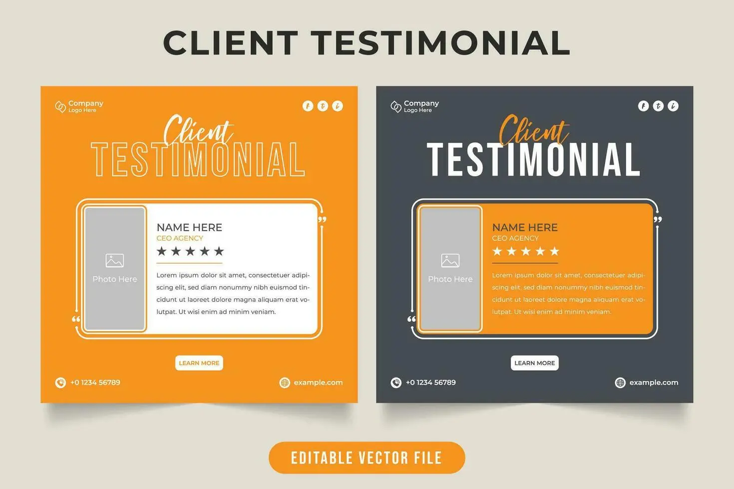
As we already know, without testimonials, it is highly unlikely that someone just by scrolling your website will decide to buy your product.Most of the time, each website has separate page for
testimonials and it’s most of the time can be associated with the partners as well, so testimonials go hand in hand with partnerships and collaboration.
Let’s imagine this situation: potential client (X) enters your website, X checks your ‘Testimonials’ page, gets convinced and here X comes to buy your service.X went through the authentication step, then pricing step, then through additional steps that X do not care that much and finally X reached payment section. And exactly here, X realized that actually X forgot about the testimonial part, the ones that X remembers are already not convincing, X got hesitant and uncertain and left your website. It’s not a rare case, but rather daily cases of many potential customers. So, what was the thing that stopped X from buying anything? The answer is pretty clear, lack of trusting guidance along the UX journey. Customers simply forgot the criteria of trust that you put in the ‘Testimonials’ section.
Business owners need to know that almost every potential client struggles with this issue and your first goal should be to lead them along the way with the constant liability guidance via UX Design.
➔ Add testimonials directly next to your main CTA-either add it as a push-up notification or as info icon that they can click for constant reminder
➔ Use real client names-it could be great to add the Linkedin profiles of the reviewers to your testimonials, with that customers can feel that the reviews are real and relatable
➔ Clarify what happens after users click or submit a form- if client is clicking on more info option, he/she should be redirected to the requested page, and not to the completely different one, that can spark misunderstanding and scare off clients
Building trust takes time, but after that, every user (even the one who is far from doing any shopping) that will enter your website will be solid about the decision of making a purchase via your website.
As you can see, you don’t need complex animations or trendy layouts to increase conversions. Your website should provide trust, smooth interaction and accessible navigation. By focusing on these three main principles, UX becomes a silent salesperson-guiding users naturally toward conversion for your business.