

Why Mobile Visitors Behave Differently — and How to Design for Them
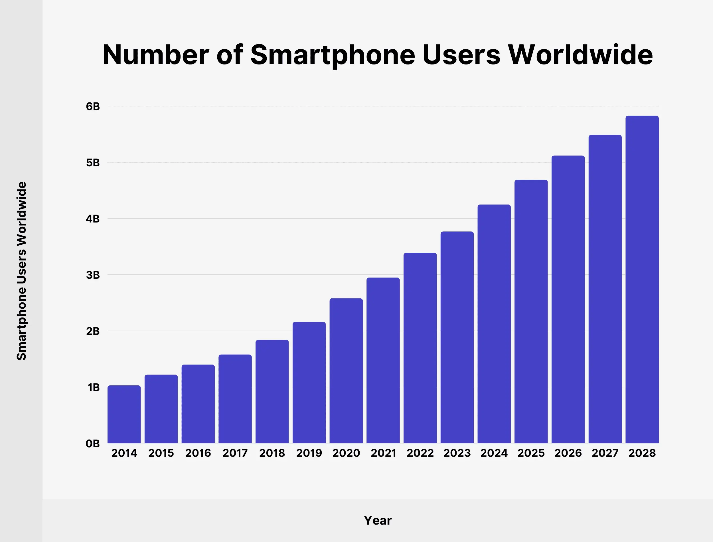
Experts are mainly talking for ages about the desktop version of the website, but currently we see the significant switch from desktop to mobile version. The behaviour of the users there is completely different, because they tend to use the mobile phones when they are in a hurry, and idle browsing or any other time-consuming activities, or digging of information is usually done on their PCs. That’s the main reason why all the online customers would look for a smoother browsing experience.
So, today we are going to give the most useful recommendations on how 90% of the potential customers will act in your app and what moments you should take into consideration before starting working on your app.
The Psychology Behind Mobile Behavior
Mobile = “On-the-Go” Usage
No matter how hard business owners are, the behaviour of the mobile users is completely different when it comes to browsing.It usually happens in short, fragmented sessions. Basically the whole process looks like that:
- Find information
- Make a decision
- Complete a task
They are not browsing for fun — they are trying to get something done fast.
So what should you do in that situation:
- 100% be ready that interruptions will happen
- Save user progress automatically
- Make key actions instantly accessible
Chaotic Conversion Behavior
Effective mobile conversion optimization starts with speed improvements and streamlined user experiences. Your mobile checkout process needs to be simplified by reducing form fields, offering guest checkout options, and implementing popular mobile payment methods like digital wallets. Most of the time,mobile users often start the journey, but don’t always finish it and try to implement the following steps to minimize this behavior.
Practical actions:
- Allow users to save items or progress
- Enable easy login (Google, Apple, etc.)
- Sync data across devices
Design for One-Hand Use
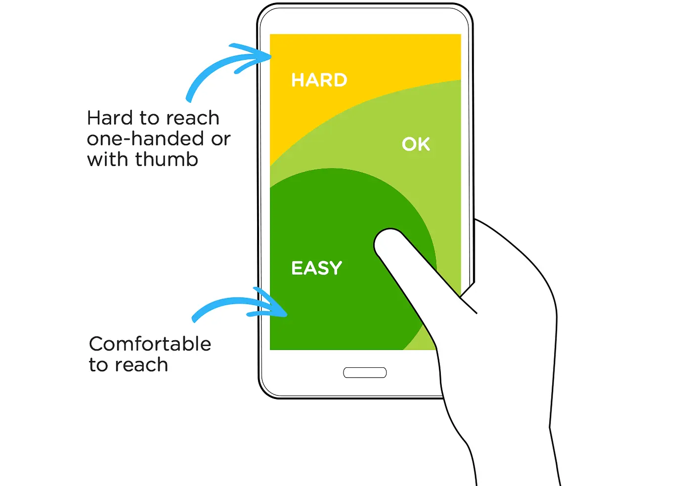
Though not everyone,mobile users change the way they hold their phones very often, sometimes every few seconds. Changes in how users hold their phones appeared to be related to their obligation to switch. Most users hold their phone with one hand. Your mobile design should reflect that.
Practical actions:
- Place primary buttons near the bottom center
- Use large, tappable elements (minimum ~44px)
- Avoid crowded layouts
Keep in mind that mobile users are not just desktop users on a smaller device,they operate in a completely different context which is faster, more distracted, and more task-focused. Because mobile design should be invisible, simply the one which lets users get things done.