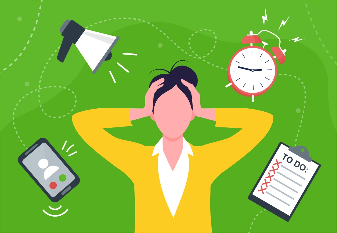
Why User Friction Silently Kills Conversions
User friction is that invisible but yet very damaging problem that makes a visitor pause, hesitate, or work harder than expected. As user friction is not a bug or the collapse of the platform, but simply illogical Unlike obvious bugs, friction often goes unnoticed, but it quietly drains conversions, increases bounce rates, and wastes marketing spend.
While many businesses focus on traffic growth, the main obstacle is being neglected, such as the buying process that requires extra steps, slow loading times, or complex navigation, friction breaks user intent, reduces trust, and forces abandonment. So, today, you will be able to check if your website is struggling with user friction and how to fix it once and for all.
Too Many Steps In Buying Process Create Decision Fatigue
“Every extra click from potential user on your website costs you money”
Your business website pages should be as clear and practical as possible. Every extra click, form field, or page adds cognitive load. Potential clients don’t know about UX Design, they just see that the whole user experience is very long and boring. The following elements on your website are the direct examples of user friction.
- Sign-up forms asking for unnecessary information
- Checkout processes split into multiple confusing steps
- Forced account creation before showing value- though in some cases creating an account can be mandatory, the whole registration process should be short and clear.
As you navigate the process of creating user experience, you should take into consideration the following fixes to build the practical buying process:
- Curate Choices: The range of products presented on your website can be limited, as more options do not always equate to better conversions. Try to list the most popular and daily choices there.
- Streamline Checkout: The number of steps to purchase should be minimised to 5 in order to create a “frictionless” experience.
- Provide Clear Information: Do not hesitate to use comparison charts, clear categories, and concise, high-value information rather than overwhelming data. Data is mainly needed in B2B businesses, while the B2C only focuses on simple, yet interesting websites for the customers only.
Decision fatigue isn’t just a buzzword; it heavily affects how consumers behave, their trust in brands, and ultimately their buying decisions. By weaving behavioural insights into your marketing strategy, you’ll not only improve user-friendliness but also secure a lasting competitive edge on local and global markets.
Misleading Messaging Forces Users to Think Instead Of Purchasing
Though sometimes misleading messaging and deceptive patterns in user experience (UX) and marketing are designed to manipulate consumer behavior, oftentimes it backfires the owners themselves by causing users to hesitate, think critically, and ultimately abandon the purchasing process. Among the misleading copywriting can be hidden information, fake urgency, and confusing language, forcing a transition from an emotional, automatic buying state to a rational, analytical one.
It is important to take into consideration the whole purchasing process of the client, if, in some cases, the client doesn’t buy anything, it doesn’t mean that he/she needs to be in the black list of the company, every copywriting of the page should be respectful and according to the branding:
- Hidden Costs and Fees: All the extra charges (shipping, service fees) should be indicated clearly prior to the start of purchasing.Avoid revealing extra charges only at the final checkout stage acts as a “drip pricing” tactic that frequently results in cart abandonment.
- False Urgency and Scarcity: Though some tactics can work, mainly messages like “Only 1 item left!” or fake countdown timers, when perceived as dishonest, cause consumers to stop and question the brand’s integrity.
- “Confirmshaming”: This details is extremely important if the client decided not to go forward with the purchase.Using manipulative language to make users feel guilty for declining an offer (e.g., “No thanks, I don’t like saving money”) can turn potential customers off, making them feel manipulated rather than persuaded and basically making them the haters of your brand.
- Forced Continuity/Subscription Traps: Every subscription notification should have a clear ‘unsubscribe’ button. Hiding the ability to cancel a service or forcing a subscription after a “free” trial often leads to customer frustration, complaints, and brand abandonment or even legal actions.
- Automatic sneak into basket: Automatically adding items (like insurance or accessories) to a potential client’s cart forces a user to stop shopping to audit their basket, often resulting in them removing the extra items or abandoning the purchase altogether.
With Intactdia team, your brand’s user experience is clear to every viewer.With the decade long experience, Intactdia can adjust the copywriting part of your business to all needs both on local and global market by adding one clear primary CTA per page,headlines focused on outcomes, not features and simple, direct language.
User friction is dangerous in all aspects as it doesn’t announce itself with errors or warnings-it works quietly in the background, reducing conversions one hesitation at a time. For the thriving of your business, you need to partner with a strong marketing team to implement fewer steps, faster experiences, and clearer messaging that don’t just improve UX; they directly impact revenue.